All dashboards are made up of Portlets that can be dragged onto the dashboard and then moved around as required.
The following chart portlets are available in Enterprise Tester.
Burndown Chart
:
- Gauge Chart
- Pie Chart
- Report Chart
Gauge Chart
These Burndown charts allow you to track the progress of your testing against your estimated progress over time. You can create burndown charts for either a specific execution set package/folder or for a specific set of data by using a saved query. See Searching & TQL for information on how view summary data from any of the saved queries you have created. This chart is particularly useful when you want to see an indication of the ratio e.g. Progress vs. Total. See Searching & TQL for information on how to create these queries.
- Drag and drop the Burndown Gauge Chart from the available portlets onto your dashboard.workspace
- Click on the Configuration button .
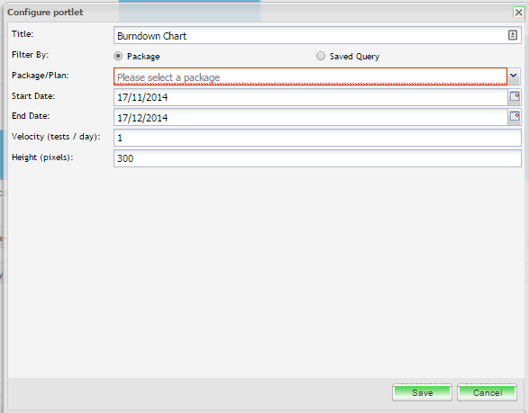
- Enter in a title for the chart. This will be displayed on the title bar of the portlet on your dashboard.
- You can select the data you which to chart by selecting either an execution set package or a saved query.
- Enter in the start and end date. By default these fields will default to today's date and the date one month later, respectively.
- Enter in the velocity ( tests/day)
- You can select to change the height of the portlet. By default the height for all portlets defaults to 300 pixels.
- Once you have completed the fields, click on Save and the portlet will be displayed.
...
- and enter the required configuration
- Click on ‘Save’
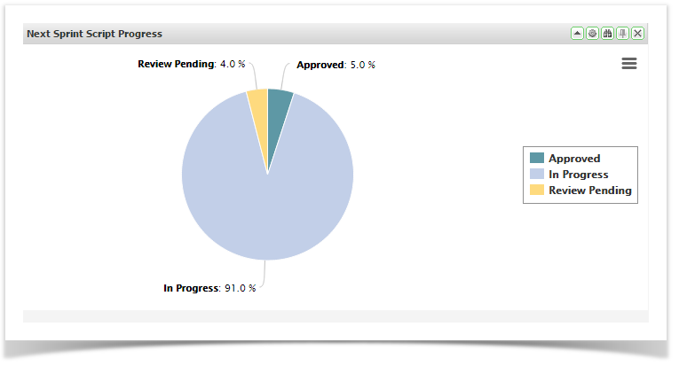
Pie Chart
Pie charts allow you to view summary data from any of the saved queries you have created. See Searching & TQL for information on how to create these queries.
- Drag and drop the Pie Chart from the available portlets onto your dashboard.
- Click on the Configuration button.
- Select the saved query you wish to chart from the drop down.
- Enter in the field you wish to represent on the pie chart.
- Select the function from the drop down. The available options are: Count, Sum, Average, Max and Min.
- You can also select additional display options including, Include Zero Counts, Include Null/Empty Values, Donut (chart style), Hide Segment Labels, Animate, Display Shadow and Height
- Click on ‘Save’.
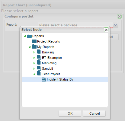
Report Chart
These allow you to view summary data from any of the classic reports that have been created for the projects. To use this portlet you will have had to create reports via the Report Tab in the explorer.
...
- Drag and drop the Report Chart from the available portlets onto your workspace.
- Click on the configuration button on the portlet.
- A dialog box will appear.
- Simply navigate to the required report.
- Select ‘Save’.
...
-
- The report selected will now be displayed on your dashboard.
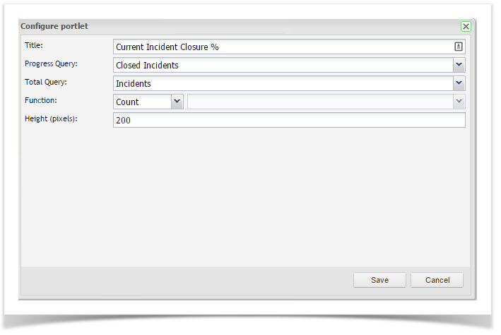
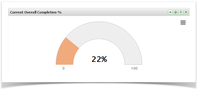
Gauge Chart
These allow you to view summary data from any of the saved queries you have created. This chart is particularly useful when you want to see an indication of the ratio e.g. Progress vs. Total. See Searching & TQL for information on how to create these queries.
...